
Learning on the Shoulders of Giants
If I have seen further it is by standing on the shoulders of giants. - Isaac Newton
When I began writing my first iOS app in Apple’s Swift language, I soon noticed that even though I began to understand the language I still felt insecure in how to properly make use of it. So I decided to try a new learning approach, one that was also chosen out of necessity:
Since a main component of my app will be a list of images accompanied by text, I ran into an interface design issue: One cannot design a single color scheme that suits all images it might possibly have to depict. As all good product creators do when in doubt, I decided to stea get some inspiration from people who had already faced this issue.
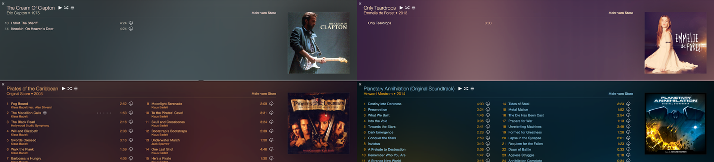 iTunes extracts color data and frequency from the image and uses automatically determined contrasting colors for background and various font styles.
So I started researching various methods of implementing this feature and stumbled over this stackoverflow thread in which Seth Thompson managed to reverse engineer the algorithm with a bit of mathematica magic.
I also found a great post by the talented people over at Panic. In which they published their own Objective-C implementation of the feature. Which was already closer to what I needed, although it was written in Objective-C and targeting Macs only. But via their github repository I found a fork of their code that was already adapted to iOS, but still written in Objective-C. Kudos to user fleitz for the iOS port.
This is where the actual learning comes in: I took fleitz’s implementation and started to port it (basically re-writing it line for line) to native Swift code. This way I not only learned a great deal about Swift, but also about it’s ancestor Objective-C and the frameworks they share.
As I had only a basic understanding of Swift and short of no knowledge of Objective-C, I ran into a few issues. But thanks to the kind people at stackoverflow I managed to get past all of them.
To extend my learning experience I also - for the first time ever - started to strictly apply a code guideline to my work. In this case the Ray Wunderlich Swift Style Guide. Reading the whole of it really gave me some insight into why certain concepts should be enforced in Swift.
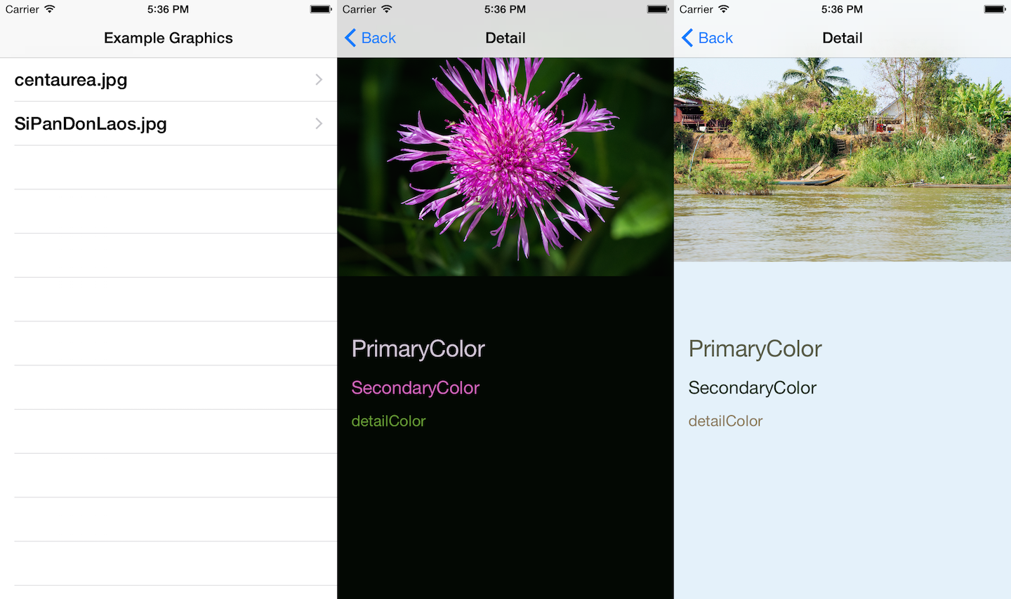
The final result now looks something like this and can be found at github.com/Jan0707/SwiftColorArt
Coming back to title, I can only agree with the saying. I am proud of the work I did here, but none of it would have been possibly if not for the giants on whose shoulder I am standing right now. I am just happy that I was able a little bit of magic myself here. And I am sure there is more to come. I have some more plans for additional features and improvements for the code. But right now, after the four nights I spent on the topic really all I wanted to do was, to say:
Thank You Giants ! Thanks to Apple, the nice guys at Panic, the omniscient people at stackoverflow and all the people whose shared and public code I could read and use on github
PS: Of course this code will not only be open source, but it will also be made available as a library via CocoaPods as soon as the swift integration in CocoaPods is stable.